Sunday, 3 April 2016
Music Video - Main Text
This is the final version of our music video for Kendrick Lamar's Swimming Pools.


Evaluation Question 4
How did you use media technologies in the construction and research, planning and evaluation stages?
Thursday, 31 March 2016
Sunday, 27 March 2016
Wednesday, 16 March 2016
Evaluation Question 1
In what ways does your media product use, develop or challenge forms and conventions of real media products?
MUSIC VIDEO

From a marketing perspective, another way that we met conventions of rap in our video is by uploading the video to YouTube. This is something that has become almost essential for any successful marketing campaign for a song or album and the vast majority of any music videos created across every genre are uploaded to YouTube. Part of the reason that this is so successful is due to the media convergence that it exercises. By combining the traditional methods with the modern methods it ensures that the campaign has a vast reach and enhances the effect for each method. Part of the reason that Youtube is so effective in particular is that it combines a video service with elements of social media such as liking and favouriting videos making it easier for content to go viral. By doing this ourselves we have ensured that the we are meeting an essential convention.
In terms of a response from the audience for this video, I feel that we have been somewhat unconventional with this video. Following Stuart Hall's ideas about responses to texts, I feel that our preferred response was a message of moderation when drinking which is something that is not usually conveyed in the genre of rap. However one issue with this is that if it came across as a video preaching then it wouldn't be as popular as possible. This problem is addressed by the song itself in the fact that it appears initially, from the hook of the song, that it is a pro drinking song, however this is not the case. I wanted our video to replicate this. In some ways this combines the ideas of a negotiated and preferred response in that there is meant to be some ambiguity of the response. One danger in this is that it could also lead to a oppositional response in that it's possible that an impressionable audience could perceive the video to be pro drinking. However, as seen by the graph shown above, it is clear that the preferred response is certainly illustrated in our video.
MAGAZINE AD
MUSIC VIDEO
One of the main factors when creating our video was including the somewhat non-conventional message of drinking in moderation and the dangers of excess whilst still portraying a conventional video that is enjoyable to watch.
A major element seen in our video that caters to both aspects of this is the motif of the golden flask which is also present throughout our other two products. This could be seen as conventional as it glorifies drinking and also excessive spending which is definitely something that is present in the genre of rap. However, our intended interpretation for the golden flask is the value that is placed in drinking by society and highlighting how this may be somewhat misplaced. I feel that we have successfully developed upon this convention in that our intended reading for the video as a whole was picked up upon by the audience, reflected by the fact that the vast majority of viewers said they saw this representation, as shown in the graph below.

A technical element included in the video was the editing that we used. We made sure to make cuts on the beat of the song which is something that is common in all music videos and especially in rap. This helped to give an element of continuity between the song and the video that we have created. Another thing that we considered when editing was Altman's ideas about genre pleasures. Out of the visceral, emotional and intellectual response, we thought that rap videos are generally made to create a visceral response (an idea that I have investigated previously in my blog). We thought that this editing technique was a vital element in creating a visceral response to the video.
Something that I have previously looked at is the gender representations in rap videos, particularly the negative representations of women. This representation of women in media products is something touched on by Laura Mulvey with her idea of the male gaze, in which she comments that women are placed in media products and objectified for the gratification of men. I feel that this is one convention of rap that we have subverted in our video. The girls shown in our video have a purpose for the narrative and whilst they are not the main characters they are not shown in a way which is demeaning which can often be seen in videos such as the Alright video by Kendrick Lamar that I have analysed previously. One way that we ensured that this was not an issue was through the use of costume, ensuring that the clothes the girls in our video wore weren't overly revealing.
 |
| Screenshot from our video |
 |
Screenshot from the 'Alright' video
|
In terms of a response from the audience for this video, I feel that we have been somewhat unconventional with this video. Following Stuart Hall's ideas about responses to texts, I feel that our preferred response was a message of moderation when drinking which is something that is not usually conveyed in the genre of rap. However one issue with this is that if it came across as a video preaching then it wouldn't be as popular as possible. This problem is addressed by the song itself in the fact that it appears initially, from the hook of the song, that it is a pro drinking song, however this is not the case. I wanted our video to replicate this. In some ways this combines the ideas of a negotiated and preferred response in that there is meant to be some ambiguity of the response. One danger in this is that it could also lead to a oppositional response in that it's possible that an impressionable audience could perceive the video to be pro drinking. However, as seen by the graph shown above, it is clear that the preferred response is certainly illustrated in our video.
(Modern example, our ad, and an ad from the 90s)
DIGIPAK
When creating our magazine ad, it was vital that some conventions were followed in order to create an effective ad. For example, the title of the album and the artist being clearly shown was thing that was present in every ad we found whilst researching - without it the audience wouldn't have the information needed to purchase the album. We also added the release date for the album, seen clearly on the 'Yeezus' ad on the left of the image above.
Another detail we found on other adverts was the record label being present on the ad. Therefore we decided that this was something that should be added to our ad to give it a more professional feel. This wasn't present on the 'Yeezus' ad, however this is notable for being one of the most minimalistic advertising campaigns in recent times when it comes to use of traditional media, so we decided not to follow this so closely and include the label.
One convention that I was a little surprised not to find so frequently in adverts I found online was the social media for the artist or the label. Convergence between traditional media and more modern techniques is something that is increasingly vital for a modern advertising campaign so we decided that this is something that we should include regardless of the fact that it didn't appear to be a convention.
One thing that appeared to be a convention that we chose not to follow was the inclusion of the artist in an advertising campaign. This has become less prominent in recent times, but as shown by the Dr Dre advert above it is clear that is something that is a part of the rap genre. However, as our video shows the story of a character and not an artist, we felt that in order to keep continuity it might be best to not show the artist and instead common motifs from the video. This lead to the inclusion of the flask, as opposed to the conventional image of the artist.
DIGIPAK
(An example of a modern digipak (bottom), compared to ours)


For the creation of our digipak, there were certain elements that needed to be included. For example, on any conventional album there will be the artist name, the album name and the tracklist present somewhere on the artwork. This can be seen when looking at the 808s and Heartbreak digipak example shown above.
The front cover of our digipak doesn't feature the artist, something that is frequently present in the genre of rap. However, this isn't something set in stone; the 808s and Heartbreak front cover doesn't feature the artist. This can also vary within an artist's discography, for example as seen below, the artwork for Drake's single '0 To 100' and album 'Nothing Was The Same' vary.


The minimalism seen in the '0 To 100' cover was something that inspired the creation of our own front cover. I liked how the attention was immediately attracted to the centre of the artwork where the song and artist name are present and this was something that we looked to incorporate. I feel that this has been done successfully in our digipak in that the only features of the cover are found in the centre giving it a striking appearance.
Another convention that we wanted to include in the digipak was credits for feature artists and producers. Feature artists are something that is frequently seen in album artwork, again this is present in the 808s and Heartbreak digipak, so we felt that this was an essential element to include for a professional feel. The production credits for the album is something less conventional to be seen on the main artwork for the album however we wanted to include this to give the audience more of a feel for the creation of the album.
Friday, 4 March 2016
Magazine Ad Research

This ad is something that contrasts strongly to the Yeezus ad that I previously looked at. In this case the artist takes prominence with the title and album name also shown clearly. Going forward, I'm not sure this is something that I will look to incorporate into our magazine ad. I think that the approach taken in the Yeezus ad is something more modern and following this would help us follow the conventions of modern rap, something that our album fits into. However looking at this ad has definitely helped to give me an understanding of the development of the genre of rap and how this is reflected in advertisements.
 |
| The ad I previously analysed |
Setting and Location Research

One of the main sets that we are planning on using is a kitchen space to shoot the majority of the party scenes in our video. There is a kitchen space at college that we could use to do this, and with a bit of adjustment (such as taking down posters) we can make it look like a genuine kitchen from a home. I think that this set would definitely work and therefore we are going to be doing shooting in this set. One good thing about this set is the sides that will allow us to do the drinking shots that I've outlined in previous posts.

Whilst not ideal as shown in the photo, the common room at the college is something that I think can be turned into a front room looking space. The chairs could resemble a sofa allowing us to create a more homely feel.

The roof is another space that we are going to look to use. One way that it will be good is for shots if the sky line as it is a good open space. We could also use it as another option for the part of the video where the character's conscience is speaking.


The turntables and mixers shown in these two pictures would also be a good thing to incorporate into our music video to depict transitions in the song visually.
Wednesday, 20 January 2016
Initial Planning - Magazine Advert

This image shows the initial ideas we had as a group for our magazine advert. One of the ideas that came up during this process was the idea of the hip flask showing spilt alcohol. I think the symbol of the hip flask is something that we want to incorporate throughout our whole project. Another idea that we had was a depiction of a city skyline; I think this would be a good idea to conform to the idea of loyalty to where you are from in the rap genre.

Looking at a previous advert I've analysed, I think a simplistic approach to the advert could be a good idea. I like in this ad how the album cover takes prominence giving a clear idea of what it is you are going to buy. This minimalism is definitely something I'd like in incorporate in my product.
Sunday, 17 January 2016
Shooting Schedule

Having drawn up a storyboard for our video, we are now in a position to create a schedule for the filming of our video. The above image shows the dates in which we intend to film, as well as containing information on the things we'll need for each shoot. This was an important step to help us remain organised.
Storyboard
Developing upon my earlier post about our initial ideas for a storyboard, my group and I have translated this into a complete storyboard for the video we hope to create.

These shots are for the intro of the video and also for a repeated theme we want to include in the hook of the song. One thing to note is that for the final shot the action will gradually change with each hook, with the character in the video being more drunk with every hook.

One of the most ambitious choices we have made in the video is the incorporation of a green screen shot, at a part in the song where the lyrics describe a internal conversation with the character's conscience.

Wednesday, 13 January 2016
Prelim Video Feedback
In order to learn further from our preliminary video that we created, we asked people to leave feedback on the video after watching it, to let us know what could be improved upon or even what we did particularly well. These are some of the comments we received:


The comments we got were generally positive. One of the main compliments we got was the time of our shots with the music, which is something we need to make sure we maintain going into the real thing. One piece of constructive criticism was about when the video cut out, however this should apply in the real video as we will be creating for the whole song and therefore this shouldn't be a problem.
Props and Costume Planning

This is a list of props that we are going to need for our video. It has details for who is responsible for the prop, how we are going to get it and when we will need it.
 |
| An image of the Golden flask that we will look to use in our video. |
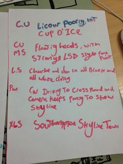
Initial Storyboard Ideas
These sheets detail the initial ideas that we have for the shots we want to take in the filming of our video. Whilst these are vague ideas for the time being, we will at a future date compile a complete storyboard in chronological order to give a better structure to our recording schedule.
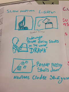
These shots are more artistic, visceral shots that have the purpose of creating a an abstract feel to the video whilst still communicating the party and drinking culture. For example, the shot which has people doing shots on the motif of 'drank' in the song would be visually impressive but also show mass drinking.
This is a more detailed list of shots that we want to create in the video. These are again more abstract shots that we want to incorporate. Going forward I feel the thing that needs padding out based on what we have now is the narrative aspect of the video, to create a more relatable, powerful message.
Monday, 11 January 2016
Swimming Pools - Music Video Analysis
Swimming Pools - Music Video Analysis
In order to gain an understanding of the song and to gain some inspiration for our product, I am going to analyse the official video for Swimming Pools.

This is a screenshot from the start of the video. This shot shows a bottle falling and smashing, however the shot is flipped. This gives a distorted effect to the shot, reflecting upon drinking and how this distorts your view of reality. This bottle is also the only thing in the shot, perhaps reflecting upon how important some people find drinking and the value they place in it.

This is a screenshot of the artist Kendrick Lamar sat in a room with a bottle of alcohol. The shot is through the door, almost suggesting that Kendrick is ashamed of his habit and that he wouldn't want people to know. This could be due to drinking costuming his life. His performance, looking down to the floor with his body closed up suggests vulnerability. Furthermore, the shot has low saturation. This could be to reflect upon how drinking can take excitement out of life when it becomes a consuming habit.

This shot shows Kendrick falling in a black space. this could be representative of how he has fallen to drinking, and the darkness reflects upon the negative influence this has had on his life. The costume that Kendrick is wearing is also noteworthy; the red colour of his jacket and trousers could be representative of his conflicted relationship with alcohol; the colour red can represent both love and anger and this could be similar to how he feels about drinking.

The camerawork in this shot is particularly interesting, as it is a handheld shot with a lot of swing. This represents the disorientation that drinking provides, and this is reinforced with the fact that the shot is of a bottle of alcohol.

The colour in this shot is particularly relevant, as the overwhelming visual aspect is the colour red. This is in the context of a party, however it is ambiguous as to whether this is lighting at the party or whether it is a symbol for how you 'see red' when you drink. This could be to show how drinking has resulted in Kendrick not having the same view on his life as before. Furthermore, the people in the shot are drowned out by the powerful red. This could represent the disregard that drinking can give you for other people.

This flashback shot is in black and white, perhaps suggesting that it is a negative memory. The performance of Kendrick Lamar in this shot shows him stumbling along the street, perhaps showing how he is drunk in this memory. Therefore, the combination of the black and white as well as the performance of the rapper paints a picture of a negative memory instigated by alcohol consumption.
In conclusion, the tone of this video has a negative view upon drinking, however one thing I haven't analysed is the shots of women dancing that I feel dilutes this image. However, one thing I can take inspiration from in this video is the use of handheld camera shots that show the impact of alcohol in a very visceral way.
Thursday, 7 January 2016
Font Ideas

The first font that I've looked at is Nervous. I found this font on DaFont.com and thought it was a good option as it looks distorted. This would be good as it helps to create the idea of an altered sense of reality that happens when you are drunk. One issue I have with this font is that the distortion comes at the expense of clarity, making it hard to read the font. I think this a case where a balance needs to be found.

One of the reasons I like this font is that it has a grime feel that I think could be suited to the genre. It also remains readable which is an advantage over the first font.

I think this font is a possibility because it is more unique than any others. It would give a unique feel to the video which would help it to stand out.
In order to get a better grasp on what font the audience may want to see in our ancillary tasks, our group created a questionnaire. One of the main questions was which font was their favourite. Here are the results for this question:

The results to this question show that the audience preferred 'River Drive' font. However some of the feedback also indicated that whilst the third may have been their favourite, it doesn't suit the genre of rap. For example one response said:
"It could be used for it (rap), but I would have said the second choice would be more rap based"This is a notion that it supported by the rest of our results, with three of the five people who chose 'River Drive' saying that it didn't suit the genre of rap. Therefore, to stick to conventions it might be a good idea to consider one of the other fonts. One interesting piece of feedback about the Nervous font, the second most popular, was this:
"It's edgy but you can also clearly read it"
This is encouraging as it supports the distorted feel that we will probably go for with our ancillary tasks. The 'Nervous' font gives an option that illustrates the distortion we're aiming to show whilst not being unreadable.
Wednesday, 6 January 2016
Prelim Video
This is my prelim video which I created as practice and preparation for my music video I am creating. It mirrors the music video for Roses by Outkast.
Copyright Letter

This is the permission letter I sent off to Aftermath records to get permission to use the song 'Swimming Pools' in my video. The transcript of my letter:
1 Copsewood Road
Southampton
SO18 1BU
England
16th December 2015
2220 Colorado Ave
Santa Monica
California
90404
USA
Dear Sir or Madam
I am a student of Media Studies at A level and I would like permission to use your song, Swimming Pools by Kendrick Lamar, for a music video that we are planning to produce as part of our course. This would involve having the track play over our own video that we have produced originally, as an interpretation of the song. This would be for educational purposes and not screened to an audience.
Yours sincerely,
Aidan Emberton
aidemb98@hotmail.com
Subscribe to:
Comments (Atom)